
Jaime Nacach
Marketing Strategist
I love helping small businesses with their digital marketing and business strategy. I'm a young man with a passion in entrepreneurship and international experience in business development, marketing, sales, and web/graphic design.
Find me on: Team Page | LinkedIn | Google+ | Personal Website
The Key to Good Photography for Your Marketing

If within budget, key branded photography for your marketing materials is a winning marketing tactic. Never underestimate the power of a good visual...as they say, a picture is worth a thousand words!
Photography and visuals help to quickly communicate with your target market and can create a magical, speedy sense of connection.
With a photograph, a consumer can quickly understand why they should be interested in something, how they make connections with it, where it fits into their life and, essentially, whether or not they should take that call-to-action to keep reading, click, sign up or more.
You Probably Need More Call To Actions, But Do You Know What They Are?

Have you ever joined a social media site, watched an online video or downloaded a free document from a website, just because you read that it’s free and beneficial to you?
Those are examples of a call to action (also known as a CTA). And they’re ALL over the Internet.
Why? Because they work. They are a necessary tactic to gain leads.
A CTA uses text and a link to persuade an audience to do an immediate action that is in the best interest of the company, while also benefitting the audience.
Five Neuromarketing tips for Social Media

If marketing were a Medieval Kingdom, the marriage of Neuromarketing and Social Media would be akin to an alliance between England and Spain. And while neuroscience has been around for a while, like a quiet heir waiting in line for the throne, social media has come of age with glory and pomp.
This alliance has granted us social media marketers, the possibility of better engaging our potential customers and increasing conversion rates.
How to Plan Your Content Calendar for 2016

The New Year is coming, and nothing could be more helpful than taking a good, over-arching glance at your content strategy and aligning it with your marketing goals. With a good plan laid out, you’ll always feel at-the-ready when it comes to a key arm of your marketing plan: content! So plan to build--and keep--your readership in 2016 with valuable, consistent content.
But how do you plan for content?
For starters, it’s important to look the the year ahead, as well as your goals ahead.
Don’t just pull things out of a hat or think of what you may be most interested in reading. Really get strategic! Who is your audience? Who are you speaking to? How can you content help warm them to your goals, and shape your plans? How can you lead them through your conversion funnel with interesting content? These are the types of things that will help make your content work for you!
Why Facebook Messenger is the most important tool for online marketing

Messenger is evolving into a full blown content platform… and taking on your phone number
There was a time when asking for a phone number meant something.
It took some courage, it established hope, it was a test of sorts… Would we get a fake? Would the other person answer when we called? Exchanging phone numbers could be the beginning of a fruitful relationship, or of a harassment nightmare. Once people obtained ours, we had no control.
Now Facebook proposes to change everything.
The premise: It´s easier to know a person´s name than their phone number. So why go through the trouble of asking? Not only is that uncomfortable, but using the name as a reference is a more effective way of getting in touch.
New Service: Google "Inside View" 360° Virtual Tours

We're exited to introduce Bloominari's newest service through our partnership with San Diego's top performing Google Photographer!
Introducing Google "Inside View" 360° Virtual Tours
Ever wonder how businesses are able to showcase a 360 degree virtual tour of the inside of their businesses?
Wonder no more, as Bloominari now offers local San Diego businesses or any business around the US, the ability to add a touch of magic to their online presence on search results and Google Maps.
Through our new partnership with the top performing Google trusted and certified photographer in San Diego (out of a total of 6), we're now able to help every small, medium or large business to showcase their offices, showrooms, or any other area of their physical business on Google's search results and Google Maps listings.
Why should you have a Google Virtual Tour?
How to Evaluate Online Marketing Proposals

I recently met a friend of mine, whom I had not seen in years. So much so, that he did not know I had founded an online marketing agency. He had married his college sweetheart and moved to the East Coast. As we were catching up, he shared that he had recently launched a business and hired a local online marketing agency. Then he asked me to take a look at their proposal, since he valued my opinion and “knew nothing about the Internet”.
The incident got me thinking about how hard it for a small business owner to evaluate an online marketing proposal. Though savvy businesspeople know that moving their advertising dollars from print and traditional media to the digital arena is necessary, they often lack the tools to assess what they are being offered and what to expect. If you have been looking for an online marketing agency and reading proposals, this is what you should consider…
First things first
Hopefully, before you were presented with any strategy or quote, you met with the agency. On that meeting, you should have had the opportunity to share information about your business and the goals you wish to accomplish with the campaign. The agency must describe their services and explain how they can help you achieve your vision. Though I am evidently a tech fan, I really prefer to meet any potential clients in person, which lets me get a better sense of the business and the people behind it.
10 Less “Heard-of” Reasons You Should Advertise on Facebook

Facebook is powerful, and you should use it to your advantage! For the right brand, it can be the ultimate resource.
The audience is definitely there, and with the unique targeting options available, you can probably hone in on your audience.
Read on for 10 less heard-of reasons you should advertise on Facebook!
Why, How and Where to Use Infographics

Humans have five core senses.
But they’re not all equally important when it comes to marketing.
The majority of information that gets presented to the brain is information we gather through our sense of sight. Our brains are able to process images 60,000 times faster than text. It is also estimated that 65 percent of people are visual learners. So we can safely conclude that appealing to a person’s visual intrigue is most likely the best way to garner their attention.
Infographics are reportedly 30 times more likely to be read than text - including this blog post. Are you surprised? Infographics, when used for marketing your business, can help you increase the communication of data, increase engagement on social media and increase website traffic. It’s best to take advantage of this information and use it when marketing your business.
Branding: Colors & Typography Intro

When starting your business from the ground up you may already have any idea of what it is you want as a logo.
But you may not be sure on what color or typography you want to use.
You may just think it’s not as important when it definitely is.
So why is color so important?
In a past blog, we talked about how different brands have their “special color” and how we react to them. Scientists have proven that color evokes an emotional reaction in us.
So how do you choose the color you want?
What do we want people to feel when they see our brand? Make sure you know the meaning of the color!
For example, green has to do with nature, life, renewal, freshness, money, banking and safety.

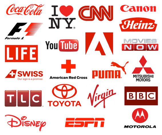
Many fast food chains use the color red because it’s a color that evokes hunger. It also gives you a feeling of energy and power but is also associated with passion, desire, and love.
Many politicians use blue on their logos because it symbolizes trust, loyalty, confidence, intelligence, faith and truth. It’s a color that produces a calming effect.

Orange is associated with joy, warmth, sunshine, balance, creativity, and health. It gives you a feeling of optimism and rejuvenation.
Not many people use this color for logos but if you want to evoke any of the above words maybe orange is your best bet.

Typography is also an important role when it comes to branding. Why? The brand is what identifies the product, service, person or place and gives it its unique personality.
Why does typography matter in your branding?
New York-based designer James Puckett had a great explanation: “I always tell people that the difference between good typography and [bad typography] is the difference between work that looks professional and works that looks like someone threw it together in MS Word. One reason Apple’s stores look so good is the careful and consistent application of [the typeface] Myriad. But Kmart’s careless mashup of Helvetica, Gill Sans, News Gothic, and Gotham looks like, well, Kmart.”
So what’s the difference between a serif and a san-serif type?
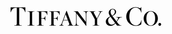
A serif type has a small decorative line added as an embellishment to the basic form of a character (a character is a letter or number). The most famous serif typeface is Times Roman. It’s a typeface characterized by its more traditional and elegant feel.
A san serif typeface is one without the end stroke. The most famous san serif is Arial. It’s easy to read when looked at from afar and has a clean look. It’s a typeface that has a more modern feel to it.

There’s a lot that goes on in a graphic designers mind when it comes to branding. It may seem like a simple task but everything has its own meaning, from color to what typography you are using.
Make sure you're evoking what you want your customer to feel when they see your brand.