

Having said that, there are millions of landing pages online today. If you browse the internet regularly, you'll probably see at least one daily.
That doesn't mean you should copy them. Many landing pages fail miserably, even though you may not be aware.
That's really no surprise as there are many elements like form length, copy, background, and so on that makes a landing page effective.
Now, you may be asking this question: is there a single landing page that works in all situations?
The answer is “No.” You need the right landing page for ‘that’ campaign or new advertising channel you have in mind.
To help you understand how to craft the right landing page for lead and sales generation, here are 15 examples of high-converting landing pages you can glean inspirations from:
1. Wistia
On its sign up page, Wistia really makes it simple with a few important form fields needed for the sign-up. Visitors to this page have no sense they're filling a questionnaire.

Added to that, Wistia adds important questions that potential users might have in mind before signing up. The answers to these FAQs are even more important as Wistia is offering a “free” account users.
Is there a catch? What are the limitations? Wistia does a good job of answering these questions as well.
2. TransferWise
TransferWise is a service that allows its users to carry out transactions using virtual bank accounts. This involves sending and receiving funds from people. also, the company offers debit cards to its users.
You'll find that on the company's landing page, the company clearly explains its unique selling propositions which are low fees and great exchange rates. Added to that, it provides call-to-action buttons for visitors to carry out all the 3 important activities they might need.

In this case, Transferwise makes it easy for users to sign up without having to read a long copy. Essentially, this copy will contain what they've seen on other payment platforms.
Being “Simple” is really effective when it comes to designing landing pages. In other words, get to the point.
3. Outbrain
This is a popular service and you’ve probably seen Outbrain articles on many popular websites. What does Outbrain do well with its landing page?

It provides testimonials of companies that have advertised on its platform. For a service like this, one of the main worries for potential customers is whether or not they’ll be able to get enough traffic for the money spent.
From popular companies to the less popular ones, Outbrain has used social proof to show a potential lead why it offers the best solution, in terms of traffic generation, demand generation, and potential lead acquisition.
4. Plated
This is a company that offers food delivery. And for a service like this, images can be more enticing than words. At least images of delicious foods can make you salivate faster than words.

This is what Plated has implemented on its landing page. It used an attractive picture of two people holding their plates of food. This represents the benefits their customers gain.
Added to this, Plated also includes its unique selling proposition in its page copy with the catchy phrase “made by you.”
5. Twago Enterprise
This company uses its unique selling proposition as its landing page headline. But the phrase “scarce talent” is ambiguous.

Therefore, it makes sense, that the call to action button on the page is “Request a demo.” This way, potential customers can see the benefits of the service before they pay for it.
6. Skype
Skype is a popular communication tool that you’re already aware of. But what can you learn from its landing page design?
This is a great example of a landing page with the minimalist design. It employs a short copy and uses a blue call-to-action button that’s obvious on the white background.

Apart from the short copy, the page uses a plain white background. This combination means there’s a lot of white space on the page and there’s little distraction from the page’s purpose.
7. Bloominari
Yes, our landing page made it to the list!
Bloominari is a San Diego digital marketing agency that helps businesses get more exposure and sales online through effective web design, search engine optimization, and marketing automation.
Considering this, we have put a lot of relevant and engaging copy on this landing page to explain our services to potential customers.

Added to that, you can see that there’s a lot of white space to help visitors skim through and still get all the important information.
The page incorporates descriptive call-to-action buttons (such as “Yes, Let’s Talk”) as you go down the page which allows visitors to convert at different parts of the page.
There are times when you just have to go with the industry standard or trend, and not try to reinvent the wheel. If something is working (in this case, a descriptive call-to-action), you should use it on your page.
8. HootSuite
HootSuite provides social media management platform for businesses. And with its landing page title, it states this clearly. In some cases, you don't need flowery words to make your point.

Also on the page, HootSuite bolds texts like manage, schedule, measure, and add.
These words help visitors to skim through the landing page and still understand the basic functions of the software without reading the whole copy.
Another thing this page does well is its green call to action button on the black background. This makes the button eye-catching to the page visitor.
9. Conversion Lab
This is a service that helps website owners to improve their landing page conversions. And its landing page is an example you can follow while creating yours.
The website has a few pages and the buttons and links on the page lead to other parts of the page. As far as I can see, there are 2 pages on the website. You can see a simple copy that shows benefits to a potential lead.

When you click on “Get help with landing pages,” it loads a form where a visitor can enter their details.

This is more like a 2-step onboarding process. Given that forms (especially multiple form fields) tend to scare people away when they first land on a page, eliminating that step can increase sign-ups and conversions.
10. Airbnb
This is a popular service that challenges the traditional hotel industry as it offers lower prices for people. However, there are two sides to the Airbnb service.
Guests who pay and hosts who keep them for a period of time. For the service to function properly, Airbnb needs hosts for their guests. One of the big questions hosts have is their potential income.

Therefore, on this landing page, Airbnb states the benefit for a host and uses an obvious red call-to-action button on the green background. It also helps a potential host calculate their potential income depending on their location and other factors.
11. RVing Planet
Buying an RV is a considerable investment that cost thousands of dollars. For people who are just buying one, they aren’t only looking at the amount of money they'll spend but also if they'll get value for their money.

RVing planet provides a free guide for shoppers on its landing page that helps them from the research stage to buying their RV. This page has a minimal background and an obvious lead capture button.
Likewise, it also shows benefits for people who get the guide. Another thing this page does well is using social proof with testimonials.
12. Unbounce
On this landing page which promotes a 7-day course on how to generate landing page leads, Unbounce has used a simple copy and unique form to capture leads.

The form has a color that’s different from the background to make it stand out. It also has an evident call-to-action button on the form. Furthermore, Unbounce added a long copy to the page to explain what a participant will gain.
In this case, the long copy works as it helps convince a visitor. It also gives the page a better chance to rank on search engines for relevant keywords. For instance, this page ranks at number #3 on Google for the keyword “landing page conversion course.”

13. ClaimCompass
In the European Union, airline passengers are entitled to compensation whenever an airline disrupts their travel plans. ClaimCompass helps passengers get their compensation without having to go through stress.

For people who have little knowledge of the process, the company provides the 3-step process to help users claim their money. The page also has its call-to-action button at 3 different parts or sections of the page.
This is to ensure that convinced visitors don't need to get to the end of the page to convert. The company offers more details to convince visitors between the call-to-action buttons.
14. AgileCRM
Agile CRM provides CRM solutions for small and midsize businesses. And this is evident on its landing page here. It shows this targeted offer in its landing page title. It also has a call-to-action button at the top of the page.
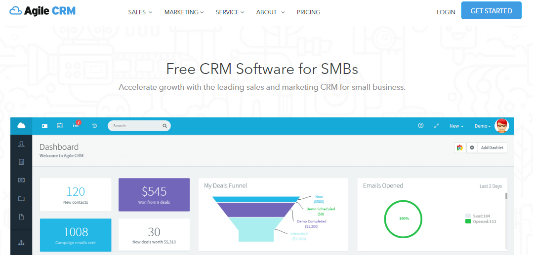
For someone who needs more details, the company adds an image of its dashboard to give a potential customer a taste of what they’ll find on the platform.
When you scroll down the page, you’ll see the features of Agile CRM and another call-to-action button which only requires an email address.
Fewer form fields encourage more conversions. For example, by using fewer fields, Truckers Reports were able to increase a page conversion by 13.56%.

15. FreshBooks
For most people, accounting is a disturbing topic. However, if you run a business, whether big or small, accounting is a vital part of your business. And this is the major claim by FreshBooks.
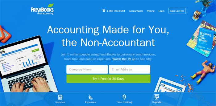
Using the word “the non-accountant” means it’s simple enough for the average user. The page also uses social proof by mentioning that 5 million people use the service.
Another thing this page does well is to use a clear call-to-action button that offers benefit to the user.
It also has a few form fields. Research by HubSpot's Dan Zarrella revealed that reducing form fields from 4 to 3 increases conversion rate by 50%.

Conclusion
There's no one fast rule that applies to how your landing page must be structured. And this list has shown varieties of pages with different features.
However, the biggest lessons are that your landing page must show clear benefits and appeal to your ideal customer.

